
Mixing Black-and-White with Color: Creating Visual Impact in Your Album
The Power of Mixing Black-and-White and Color in Photo Albums
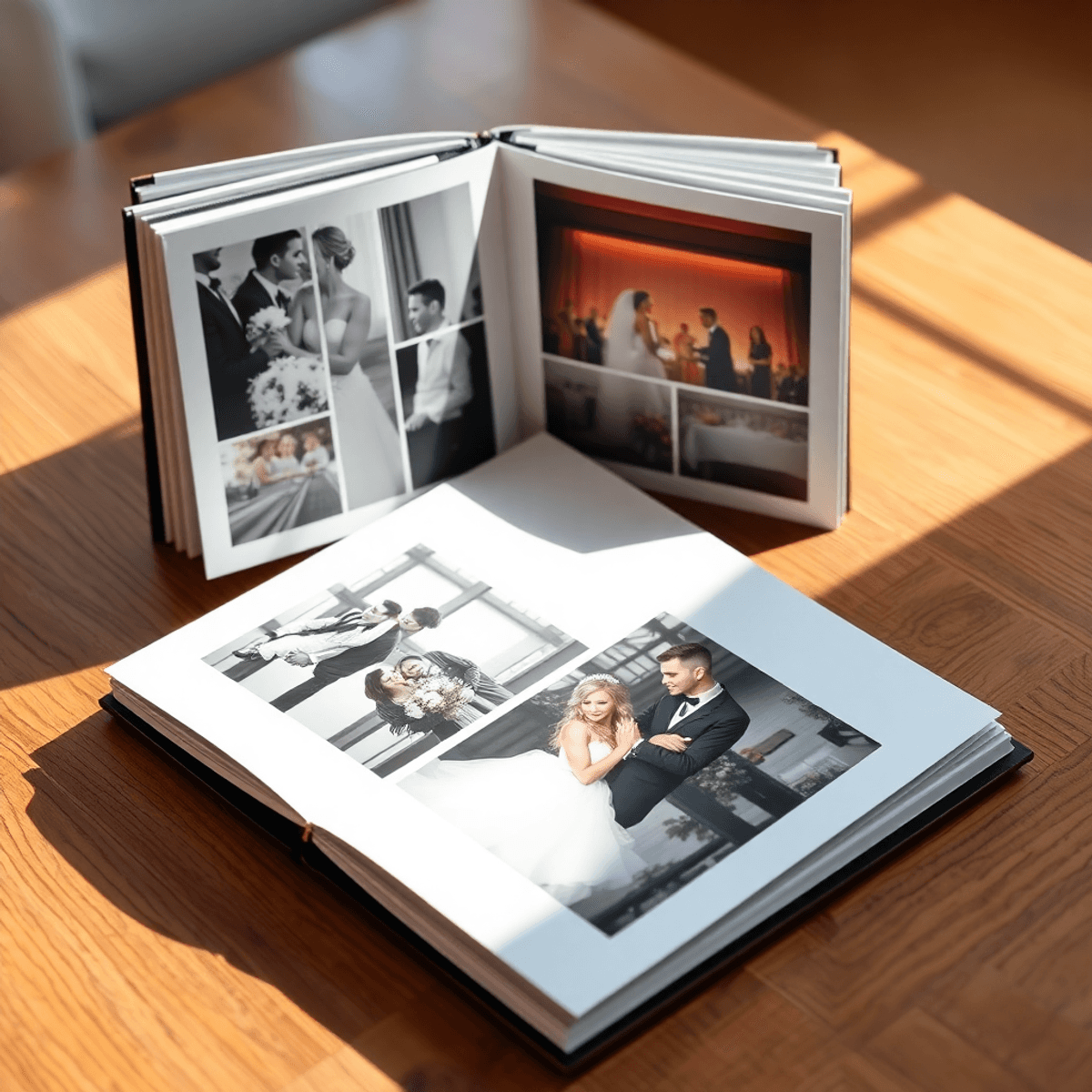
Creating visual impact in your album often means making thoughtful choices about how photos are presented. Mixing black-and-white with color offers a powerful approach that enhances storytelling, especially in wedding albums and other memory-keeping projects.
Black-and-white images bring timelessness and emotional depth, focusing attention on expressions, textures, and moments free from distraction. For instance, classic wedding photography often utilizes this technique to emphasize the heartfelt moments of the day. On the other hand, color photos inject vibrancy and life, capturing the atmosphere and intricate details that define the day. This is where a skilled St Louis wedding photographer can truly shine, as they know how to balance these two styles effectively.
Combining these two styles creates contrast and balance, guiding viewers through the narrative with intention and artistry. It’s crucial to understand when to apply each style for maximum effect. There are practical benefits for album cohesion and consistency when one masters these techniques.
This exploration equips you to create albums that are not only visually striking but deeply meaningful. Whether it's through feeding your photographer with the right information or understanding how to capture complete weddings and events, this guide is designed to enhance your photography experience.
1. The Artistic Value of Combining Monochrome and Colorful Imagery
Artistic photography thrives on contrast, emotion, and balance. Mixing monochrome aesthetics with color photography balance creates a powerful visual language that elevates your album beyond simple documentation.
Black-and-white photos strip away distractions, revealing raw emotion and highlighting texture. They emphasize the contours of a bride’s veil, the subtle expressions during a vow exchange, or the timelessness of an intimate embrace. This absence of color invites viewers to focus on feelings and forms, giving images a classic, enduring quality that resonates deeply.
Color photos bring vibrancy and realism to your story. They capture the warmth of golden-hour light, the lush greenery of outdoor venues, and details like the shimmering hues of bridesmaids’ dresses or floral arrangements. Color adds atmosphere—invoking joy, celebration, and the unique palette of each wedding day. It grounds your memories in time and place with richness and immediacy.
Combining these styles enhances storytelling through juxtaposition:
- Black-and-white images convey timeless emotions or contemplative moments.
- Color images showcase dynamic energy and environmental context.
Placed side by side, they create visual rhythm that mirrors the complexity of real-life experiences in weddings—both quiet intimacy and joyful celebration coexist. This artistic interplay allows you to craft an album with depth, mood variation, and emotional resonance that single-style approaches often lack.
To achieve this artistic balance in your wedding album, consider hiring a professional St. Louis wedding photographer who understands how to blend these styles effectively. You might also want to explore innovative techniques such as drone wedding photography, which can provide stunning aerial shots that add another dimension to your album.
It's essential to remember that investing in professional wedding photography is a worthwhile investment, as it captures not just images but emotions and memories that you will cherish forever. Whether you're planning a traditional or secular wedding, a discerning couple like you deserves nothing but the best when it comes to preserving those precious moments.
2. Practical Benefits of Using Mixed Photo Styles in Albums
When designing your photo album layout, mixing black-and-white with color images offers tangible practical advantages. One key benefit is the ability to create visual balance within pages that might otherwise feel cluttered or overwhelming.
Busy spreads filled with vibrant colors can sometimes compete for attention
Busy spreads filled with vibrant colors can sometimes compete for attention, making it difficult for viewers to focus on the emotions and details that matter most. Selectively converting some photos to black-and-white tones down the intensity, allowing key moments to stand out without distraction.
Weddings and memory-keeping projects often involve varied lighting conditions
Weddings and memory-keeping projects often involve varied lighting conditions — natural sunlight, dim receptions, or artificial indoor setups. Black-and-white conversions can unify images taken under inconsistent lighting by shifting attention away from color discrepancies and focusing on shape, texture, and contrast instead.
The interplay between color and monochrome creates rhythm and breaks monotony
The interplay between color and monochrome creates rhythm and breaks monotony, keeping interest high from one page to the next. It also allows you to emphasize certain emotions or themes by choosing which images benefit from a classic, timeless feel versus those that shine through their vibrant realism.
This approach requires thoughtful selection but rewards you with an album design that is cohesive, visually appealing, and emotionally resonant—qualities every couple desires when preserving their cherished memories. To achieve this, hiring a St. Louis wedding photographer who understands these nuances can be invaluable. They can provide additional wedding photography services that cater to your specific needs, ensuring that every moment is captured perfectly regardless of the wedding venue.
3. Key Techniques for Effectively Mixing Black-and-White and Color Photos
Achieving lighting consistency is crucial when mixing black-and-white with color photos in your album. Sometimes, harsh or uneven lighting can detract from the overall flow of the collection. Identifying those images that suffer from inconsistent light conditions is the first step. Converting these photos to monochrome can rescue them, minimizing distractions caused by shadows or overly bright spots while maintaining their emotional impact.
Enhancing Monochrome through Thoughtful Photo Editing Techniques
Monochrome enhancement through thoughtful photo editing techniques brings out textures, contrasts, and nuances that color may mask. For example:
- Photos taken under mixed light sources (natural and artificial) often display color casts that clash with neighboring images.
- Black-and-white conversion neutralizes these inconsistencies, creating a unified look across diverse shooting conditions.
- Subtle dodging and burning in editing software emphasize depth and contours for a compelling visual effect.
The Benefits of Black-and-White for Portraits
Portraits, such as family portraits or bridal portraits, especially benefit from this technique. Removing color shifts attention directly to the subject’s expression and form, highlighting emotions without competing distractions. Faces, hands, and eyes become focal points, allowing viewers to connect more intimately with the moment captured.
Selecting Photos for Black-and-White Treatment
Consider these points when selecting photos for black-and-white treatment:
- Images with distracting or clashing background colors.
- Shots where lighting causes unwanted highlights or deep shadows.
- Portraits where mood and emotion are central to storytelling.
- Scenes where texture and detail tell part of the story better than vivid hues.
Balancing these elements enhances your album’s narrative flow by leveraging both vibrancy of color and timeless appeal of monochrome — a powerful combination for creating striking visual impact.
4. Layout Variation to Maintain Interest and Visual Flow in Your Album Design
Creating an engaging album design depends heavily on photo sequencing and color contrast. Using black-and-white photos alongside color images can transform a static album into a dynamic visual experience.
Strategic placement of monochrome images helps break the monotony that may arise from pages filled exclusively with vibrant colors. It introduces variety, drawing the viewer’s eye and creating focal points throughout the album. For example:
- Insert a black-and-white portrait next to a lively color group shot.
- Alternate between monochrome and color spreads to maintain rhythm and balance.
This contrast enhances the emotional tone of the page. Black-and-white images emphasize mood and texture, while color photos provide context and vibrancy.
Pay attention to color contrast when sequencing photos. Placing two highly saturated images back-to-back can overwhelm the eye, but inserting a muted black-and-white photo creates breathing room. This technique directs attention intentionally, guiding viewers through the story you want to tell.
Consider these layout tips for better flow:
- Use black-and-white photos as visual anchors or pauses between energetic color scenes.
- Align similar shapes or lines across pages, regardless of color style, for cohesion.
- Balance heavy detail in color photos with simpler monochrome frames to avoid clutter.
Thoughtful album design elevates storytelling by enhancing how each photo interacts with its neighbors. Mixing black-and-white with color not only adds artistic flair but also provides purposeful pacing that keeps your audience engaged throughout the entire collection.
5. Simple Journaling Techniques That Complement Mixed Photo Styles in Albums
Journaling design plays a crucial role in balancing the visual experience of an album that combines black-and-white and color photos. When you mix these photo styles, your text elements need to support the imagery without overpowering it.
Use Neutral Tones for Journaling Areas
Focus on neutral tones for journaling areas—soft grays, muted earth tones, or gentle off-whites work best. These colors keep the text spaces subtle and elegant, complementing both monochrome and vibrant photos alike. Avoid bright or saturated colors that might clash with colorful images or distract from the quiet sophistication of black-and-white shots.
Choose Simple and Clean Fonts
Choose fonts that are simple and clean. Sans-serif fonts like Helvetica, Arial, or minimalist serif fonts such as Georgia provide readability while maintaining a refined look. Steer clear of overly decorative or script fonts that compete with the photos for attention. The goal is to keep text legible, unobtrusive, and harmonious with the overall album aesthetic.
Enhance with Minimal Embellishments
Minimal embellishments enhance this approach. Use sparing graphic elements such as thin lines, understated icons, or subtle borders to frame journaling blocks without cluttering the layout. This restraint ensures your captions or personal notes remain an elegant complement rather than a distraction.
Experiment with Alignment and White Space
You can also experiment with:
- Aligning text blocks consistently (left-aligned often reads best)
- Using ample white space around journaling to give breathing room
- Limiting word count per entry to maintain focus on images
This method creates clean text areas that serve as quiet pauses between dynamic photo spreads, allowing viewers to absorb the story without visual overload. The combination of neutral tones, simple fonts, and minimal embellishments builds a cohesive narrative thread throughout your mixed-style album design.
Incorporating various styles of photography, such as those offered in photo packages, can further enrich your album's visual storytelling.
Real-Life Application: Wedding Photography Albums by MDKauffmann Photography
MDKauffmann Photography exemplifies the art of mixing black-and-white with color to craft luxury wedding photography that resonates deeply with clients. Their personalized wedding albums reflect a careful balance between timeless elegance and vibrant life, using monochrome and color photos to deliver a compelling narrative.
Key aspects of their approach include:
- Elegance through contrast: Black-and-white images emphasize emotional moments, textures, and classic beauty. This choice creates a refined atmosphere that elevates the entire album.
- Vibrancy through color: Color photos capture the joy, ambiance, and intricate details of each wedding day. Rich hues bring energy and authenticity to the storytelling.
- Client-centered artistry: The mixed photo style aligns perfectly with client values such as love, family, quality, and beauty. Each album is tailored to showcase these pillars through carefully curated imagery.
- Visual rhythm: Placing black-and-white portraits alongside colorful candid shots creates dynamic spreads that maintain interest while reinforcing the couple’s unique story.
- Timelessness meets modernity: The fusion of monochrome and color bridges classic photographic traditions with contemporary trends in wedding photography design.
MDKauffmann Photography’s style transcends simple documentation. It transforms wedding albums into heirloom-quality art pieces that honor both the sacredness of marriage and the joyful celebration it represents. Their expertise in mixing photo styles guarantees albums that are not only visually stunning but also rich in emotional depth—capturing memories meant to be cherished for generations.
For those planning their special day, exploring 2026 Weddings or seeking advice on Emergency situations during weddings could be beneficial. Additionally, understanding various Wedding Venues can help in making informed decisions. For new brides-to-be navigating this exciting journey, resources tailored for a New Bride-to-Be can provide valuable insights and support.
Tips for Couples Planning Their Wedding Albums Using Mixed Photo Styles
Planning your wedding album involves making thoughtful choices about which photos shine in black-and-white and which burst with color. Use these wedding album planning and photo selection tips to help craft a meaningful visual story:
1. Evaluate the lighting
Photos taken in harsh or uneven lighting often look better in black-and-white. Monochrome tones can soften strong contrasts and distracting shadows, giving images a polished, timeless feel.
2. Consider the mood
Emotional, intimate moments—like a tearful vow exchange or a quiet embrace—often gain depth and focus when converted to black-and-white. Removing color emphasizes expressions and textures that might otherwise be overlooked.
3. Highlight vivid details
Scenes filled with vibrant florals, colorful décor, or lively celebrations benefit from full color. These images bring energy and atmosphere to your album, balancing the calmness of monochrome shots. It's essential to ensure that these colors are captured accurately, so hiring a photographer who is True To Color can make a significant difference.
4. Portraits vs. candid shots
Formal portraits frequently appear more striking in black-and-white, as it shifts attention to facial features and emotions. Candid photos that capture movement and environment often work well in color to preserve their natural vibrancy.
5. Mix for flow
Avoid clustering too many black-and-white or color images consecutively. Distribute them evenly to create rhythm and visual interest throughout the album.
This approach empowers you to transform your wedding memories into an elegant keepsake where every image complements the next, delivering emotional impact through careful style choices. Remember that the evolution of wedding photography trends has led us from formal poses to modern personalized storytelling, allowing for greater flexibility in how we capture these special moments.
Additionally, investing in high-end wedding photography can elevate your experience by capturing every intimate moment and joyful celebration in a way that reflects the luxury and sophistication of your special day.
Popular Memory-Keeping Systems That Embrace This Technique
Memory-keeping systems like Project Life albums have gained popularity for their flexible approach to storytelling, where mixing black-and-white and color photos is a natural fit. These systems encourage you to document life’s moments with a blend of styles that enhance the emotional impact and visual appeal of your albums.
Project Life Albums
Project Life albums use pocket pages and customizable cards, making it easy to combine monochrome images with vibrant color photos. This method allows you to:
- Highlight key moments by converting certain photos to black-and-white, emphasizing timelessness or mood.
- Balance busy layouts by toning down some images, creating visual rest in otherwise colorful spreads.
- Maintain a cohesive narrative flow while celebrating the nuances of light, texture, and emotion.
Photobooks
Photobooks also embrace this mixed-color style, providing the creative freedom to arrange images digitally before printing. You can experiment with:
- Strategic placement of black-and-white portraits next to vivid scenes.
- Using monochrome images as chapter dividers or thematic breaks within the album.
- Enhancing storytelling by contrasting the vibrancy of color with the subtlety of grayscale.
These popular memory systems support your artistic vision by offering practical tools that make mixing photo styles both accessible and impactful.
Conclusion
Creating impactful photo albums often begins with the thoughtful use of mixed photography styles. Mixing Black-and-White with Color: Creating Visual Impact in Your Album unlocks a powerful storytelling tool that blends timeless emotion with vibrant realism. This technique invites you to:
- Highlight key moments by contrasting monochrome portraits with colorful scenes
- Control visual flow, ensuring your album remains engaging and dynamic
- Reflect the mood and atmosphere of your memories more authentically
By experimenting with black-and-white and color photos, you craft albums that speak to both the heart and eye. The artistic balance elevates your memory-keeping projects beyond simple documentation to expressive works of art.
Challenge yourself to apply these principles in your next album. Your collection will not only preserve stories but also evoke deeper connections for years to come. This approach transforms ordinary photo collections into memorable visual storytelling experiences—true reflections of life’s beauty and emotion.
FAQs (Frequently Asked Questions)
What is the artistic value of mixing black-and-white and color photos in photo albums?
Combining monochrome and colorful imagery enhances storytelling by emphasizing emotion, texture, and timelessness through black-and-white photos, while color images add vibrancy, realism, and capture atmosphere and detail.
How does mixing black-and-white with color photos benefit the layout of a photo album?
Using mixed photo styles creates visual cohesion by toning down busy pages with selective black-and-white conversions and ensures lighting consistency throughout the album with strategic monochrome treatments, enhancing viewer engagement.
What are key techniques for effectively mixing black-and-white and color photos in albums?
Identify photos that benefit from black-and-white treatment due to inconsistent or harsh lighting, use monochrome to make portraits more striking by focusing on expression and form, and maintain lighting consistency during photo editing.
How can layout variation maintain interest and visual flow when mixing black-and-white and color photos?
Strategically placing black-and-white photos next to color images breaks monotony and creates dynamic spreads, improving album design through thoughtful photo sequencing and color contrast.
What journaling techniques complement mixed photo styles in albums?
Using neutral tones and simple fonts in journaling avoids distracting from the photo presentation while keeping text areas clean, thereby complementing both black-and-white and color images effectively.
How do luxury wedding photographers like MDKauffmann Photography use mixed photo techniques in their albums?
MDKauffmann Photography aligns with mixed photo techniques to create elegant and timeless wedding albums that cater to client values such as love, family, quality, and beauty through artistic presentations combining black-and-white and color imagery.